
 So last week, I discussed the plans for my bathroom. In good news, my bathroom was (mostly) finished yesterday. In bad news, it took far more work and far more hotel time than expected.
Let me start by setting the scene. My original plan was to have one accent wall that was a rosy, dusty, autumn-toned orange, like in the photo below. The other walls would be a teal-ish color, so that it would be like a bright autumn sky with a burst of orange. I had a bunch of decoration in mind for the walls, but the essential bit was the one accent wall and the three blue walls, with a new tile floor that looked like a pale grey wood with reddish accents to match. The trim would stay white, the hardware (like the frame of the mirror I found, and the towel rods) would be spray-painted to match the new light fixture. Our plan was for me to be in the hotel three nights/four days – enough time to level the floor, build/paint the back wall, and lay the tile.
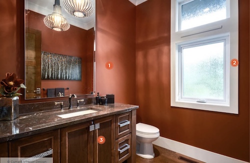
Then came the Paint Saga. So the above photo is what the paint was meant to look like, right? I matched the color swatch to this, and also to a towel so I had a non-light-based color to look at. Unfortunately, the store I went to did not mix the paint properly. It’s not the first time I’ve had an issue at this particular store. It’s literally a Sherwin Williams store. Paint is their specialty! You’d think that of anyone, they’d be able to mix paint properly! But this is the second time I’ve gone in with one of their own swatches and come out with a paint that looks absolutely nothing like what I chose. They got close on the teal paint – close enough that I didn’t mind that it wasn’t quite what I originally intended – but the warm rosy orange of the accent wall? Let’s just say that it looked like my bathroom was an Americana explosion, a Fourth of July room, patriotism unleashed.
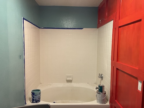
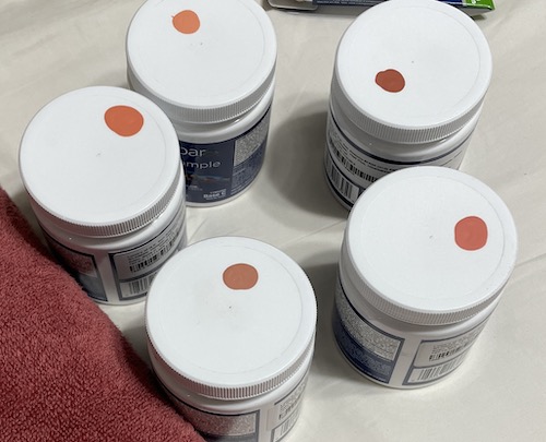
That photo is after two coats of paint, because we thought maybe it would be better after a second coat. (It was worse. At least with the first coat, it looked bright orange instead of bright red.) So I went to a different store, picked out five new swatches and got sample-sized paints to try out. (In the pic below, you can see the towel that I matched the swatch to. That’s literally the color of the swatch. How did that translated to brick red in paint???) We tested the five swatches, and I chose the one I liked best. It wasn’t my original intended color, but the rosy cinnamon brown looked better with the not-quite-right blue anyway.
We had a few other problems along the way. It was no surprise to discover that the reason we’ve had two sewer gas leaks in the last two years is because the builders put the pipe hole too close to the wall, so a standard sized toilet won’t fit properly. We had to seek out a specialty toilet with a shorter-depth, taller-height tank! Then somehow, in the middle of all of this, something dropped onto the sink and punctured right through it, leaving a gaping hole in the porcelain. Long story short, I spent an extra two nights in the hotel, we had more work than originally expected on the bathroom, and yesterday, we finally finished everything** that we’re going to do for now.

I love the way it looks! I can’t wait to start thinking about decor!
**We do still need to paint the ceiling, which has both nicotine staining from the previous occupant plus some burn marks on the ceiling above the old light fixture. But we decided to hold off a few weeks on that one!


At least, the teal is nice. 🙂
LikeLike
I actually really love the cinnamon! It’s not as rosy as I originally intended, but the teal wasn’t mixed properly either, so the cinnamon matched it a little better and I love the combo!
LikeLiked by 1 person
Looking good. Nice colors.
LikeLike
Thanks!
LikeLike
Pingback: Tippy, Mini-Tippy, and Crew | The Zen Leaf
Pingback: May 2022 in Review | The Zen Leaf